- Home
- About
- Experts
- Issues
- Projects
- CNAPS (Center for North American Prosperity and Security)
- Justice Report Card
- The Promised Land
- Dragon at the door
- Canada on top of the world
- Letter to a minister
- The Great Energy Crisis
- DisInfoWatch.org
- Managing Indigenous Prosperity
- Judicial Foundations
- Landmark Cases Council
- Closing Canada’s Border, Policing, and Legal Gaps
- Defending The Marketplace of Ideas
- Reforming the University
- Digital Policy & Connectivity
- Past Projects
- Double Trouble
- Canada and the Indo-Pacific Initiative
- The Transatlantic Program
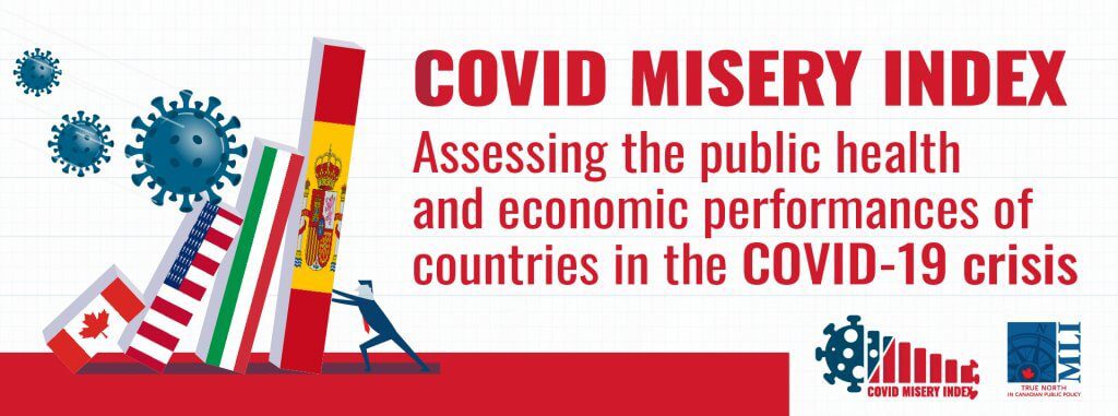
- COVID Misery Index
- Speak for Ourselves
- The Eavesdropping Dragon: Huawei
- Talkin’ in the Free World with Mariam Memarsadeghi
- An Intellectual Property Strategy for Canada
- Munk Senior Fellows
- A Mandate for Canada
- Confederation Series
- Fiscal Reform
- The Canadian Century project
- Fixing Canadian health care
- Internal trade
- From a mandate for change
- Size of government in Canada
- Straight Talk
- Labour Market Report
- Leading Economic Indicator
- Centre for Advancing Canada’s Interests Abroad
- Indigenous Prosperity at a Crossroads
- Events
- Latest News
- Libraries
- Donate
- Home
- About
- Experts
- Issues
- Projects
- CNAPS (Center for North American Prosperity and Security)
- Justice Report Card
- The Promised Land
- Dragon at the door
- Canada on top of the world
- Letter to a minister
- The Great Energy Crisis
- DisInfoWatch.org
- Managing Indigenous Prosperity
- Judicial Foundations
- Landmark Cases Council
- Closing Canada’s Border, Policing, and Legal Gaps
- Defending The Marketplace of Ideas
- Reforming the University
- Digital Policy & Connectivity
- Past Projects
- Double Trouble
- Canada and the Indo-Pacific Initiative
- The Transatlantic Program
- COVID Misery Index
- Speak for Ourselves
- The Eavesdropping Dragon: Huawei
- Talkin’ in the Free World with Mariam Memarsadeghi
- An Intellectual Property Strategy for Canada
- Munk Senior Fellows
- A Mandate for Canada
- Confederation Series
- Fiscal Reform
- The Canadian Century project
- Fixing Canadian health care
- Internal trade
- From a mandate for change
- Size of government in Canada
- Straight Talk
- Labour Market Report
- Leading Economic Indicator
- Centre for Advancing Canada’s Interests Abroad
- Indigenous Prosperity at a Crossroads
- Events
- Latest News
- Libraries
- Donate
COVID-19 Heaps Misery on Canada: Methodology and analysis of the MLI COVID Misery Index: Richard Audas, PhD
The Macdonald-Laurier Institute’s COVID Misery Index is a comparative tool designed to assess comprehensive government performance through the COVID-19 pandemic, measuring the extent to which the virus itself and our responses to it have harmed human wellbeing.
The following is an analysis and full methodology of the Macdonald-Laurier Institute’s COVID Misery Index.
Note: The Misery Index has been updated. The analysis and data presented below is relevant to the initial Index, which launched March 8th, and may not remain completely reflective of the Index beyond that date. The original Misery Index as it appeared on March 8th can be viewed here, and the most recent version is available here.
The data used to develop the Index can be downloaded here. The most recent data for the updated Index is available here.
By Richard Audas, March 8, 2021
Introduction
The impact of COVID-19 has been felt around the world by just about everyone. First and foremost, the disease has infected millions of people and almost 2.5 million have died from it.
Governments around the world have responded to the pandemic by implementing a wide range of public health measures, including border closures, stay at home orders, social distancing and mask-wearing. In addition, to manage the disease, governments implemented testing regimes to find infected individuals and have started to roll out vaccination programs with a range of vaccines as they become available. While the scope of responses has been similar from country to country, their speed and duration has varied.
Of course, such actions have had significant economic consequences. As business activity in many sectors all but ceased, unemployment increased and gross domestic product (GDP) declined rapidly; in response, governments borrowed unprecedented sums of money to avoid economic calamity. However, in most countries this borrowing has pushed governments to dramatically increase their debt-to-GDP levels. With the effects of COVID-19 expected to be with us for some time to come, this debt will increase for many countries.
It is fair to say that COVID-19 and the actions taken to mitigate its spread have heaped misery upon us all. The objective of this report is to examine the impact COVID-19 has had on us and to compare this misery using 16 measures across 15 countries.
Comparison Countries
We draw upon two sources for the nations included in our misery index comparison: the Patented Medicine Prices Review Board comparator countries used for moderating drug prices in Canada, and the Commonwealth Fund international health systems comparisons. Our list of countries includes Canada, Australia, Belgium, France, Germany, Italy, Japan, Netherlands, New Zealand, Norway, Spain, Sweden, Switzerland, United Kingdom, and the United States. Note that not all measures are available for all countries, and all data are taken from readily available public sources.
COVID-19 Heaps Misery on Canada
This section analyses the misery experienced by Canada in the context of 14 comparator nations. While many Canadians were infected with COVID-19, the incidence of the disease was lower compared to many other countries. In Canada we have had 21,761 cases per million people in the population – less than a quarter of the incidence in the United States and less than a third of what was experienced in many western European countries. Similarly, Canada has intensive care and hospitalization rates that are considerably lower than those experienced in the US and western Europe. The mortality rate from COVID-19 and the excess death rates compared to one-year prior show that the pandemic has extracted a heavy cost in terms of lives lost in Canada. However, the situation was not as dire as in the US and those European countries that were particularly hard hit. Our measure of disease control – the number of days the reproduction rate was greater than one – suggests Canada did not do a great job suppressing the disease.
Canada’s response to COVID-19 was mixed. Our testing regime has been reasonably strong: we fall behind New Zealand, Australia and Norway in terms of tests per confirmed case, but fare much better compared to the US and many of the European countries that faced much higher case loads. Canada’s vaccine program is lackluster compared with other countries – in particular the US and the UK. Canada has been slow rolling out a vaccination program, and approaches seem to vary from province to province, with some prioritizing full vaccinations (i.e., two doses) while others have been trying to get a single dose (and the protective benefits that come with it) to as many people as possible.
By either metric, Canada lags behind. However, at the time of writing, several comparator countries had yet to begin their vaccination programs. In some respects, this puts Canada in the worst of all worlds. We have not vaccinated quickly and derived the benefits that would come from this, but we haven’t waited to see if any best practice evidence emerges. Finally, Canada was one of the more stringent countries in terms of restricting behaviour to try to reduce the transmission of COVID-19. While it is undoubtedly true that these measures do work, a more targeted approach may have yielded comparable results without the concomitant misery brought on by a reduction in our personal freedoms.
The economic misery brought on by COVID-19 has been significant. Most countries, including Canada, experienced a major decline in economic activity as countries locked down. Canada’s decline in GDP in the second quarter of 2020 was not as severe as that experienced by many other countries; however, it has also not recovered as quickly as some countries which are experiencing something closer to a ‘V’ shaped recovery. Of particular concern is the sustained increase in unemployment in Canada through 2020. We trail only the US on this measure. In addition, Canada has borrowed heavily to sustain the economy and has massively increased its debt as a percentage of GDP in 2020, again trailing only the United States, and the picture is not a lot better going forward, with debt as percentage of GDP expected to rise further through 2022, as is the case in the US.
As our misery index demonstrates, while Canada was spared the worst ravages of the disease, our response to it has brought significant misery, largely attributable to quite strong restrictions in behaviour and a lagging vaccination program. The economic misery has been severe, and the projections are that Canadian taxpayers will be paying this bill for some time to come.
Misery Index Measures
We identify 16 measures for which there is sufficient data from the comparison countries and divide them into three broad categories: disease misery, which looks at data related to the direct impact of COVID-19 on populations; response misery, which reflects the recommendations and restrictions implemented by governments; and economic misery, which measures the financial impact of lockdowns and borrowing on individuals and governments.
While these measures are not the complete set of misery causing factors, they do strike a good overview of the comprehensive ways in which COVID-19 has impacted us. In the longer-term, we anticipate measures of mental health and resilience will become available that will show the psychological toll taken. The disruptions to education and the ability of countries to adapt to teaching using online platforms and home-schooling will have an impact on children’s longer-term success. However, we believe the data used provide a fulsome overview of what we know today about how this pandemic brought some misery to us all.
We would like to acknowledge and commend to readers the ground-breaking work of Australia’s Lowy Institute which earlier this year released a comprehensive ranking of countries’ performance in managing the spread of the pandemic. While we have taken a substantially different approach, this work builds on that excellent resource.
Creating an Index Score
For each measure, we create a point score, with more points equating to greater misery. The point scores are computed by conducting a standard normal transformation for each measure, converting this figure to a percentile score between 0 and 100.
Since not all countries capture all measures, the scores are averaged within each domain. So, the Misery Index score for each domain (Disease, Response, and Economy) is the average across the available measures for that country; the overall Misery Index score is the average of the three domain scores.
All data used in this Index comes from publicly available sources, as indicated below.
Disease Misery
These measures capture the health impacts of COVID-19 across each country by examining the number of cases, severe cases, deaths, and excess mortality potentially caused by COVID-19. The measures also cover the reallocation of resources away from other health needs and restriction of access to health services.
- Cases per million population: This measure captures the total caseload experienced by each of the comparison countries.
Source: https://www.worldometers.info/coronavirus/#countries
This number is the most basic measure of the incidence of COVID-19. In our 15-country comparison, the highest case count per million population is in the United States, with over 83,000 cases per million population, indicating that close to ten percent of the US population has been diagnosed with COVID-19. Many western European countries also reported high incidence, with Spain, Belgium and Sweden being particularly noteworthy. At the other end of the spectrum, New Zealand had the lowest incidence, with just under 500 cases per million population. Other countries with very low incidence rates include Australia, Japan and Norway. Canada has a relatively low incidence rate with approximately 22,000 cases per million population, so considerably lower than the US and many of the western European countries.
- Average ICU per million population: This measure captures the average number of individuals in intensive care units for COVID-19 over the duration of the pandemic (measured at the date first reported by that country).
Source: https://github.com/owid/covid-19-data/tree/master/public/data
This figure represents the rates at which patients with severe symptoms of COVID-19 are admitted to an Intensive Care Unit (ICU). Spain has the highest rate with an average of just under 45 individuals per million population being in ICU at any time during the pandemic. Early images of the Spanish Health System being overwhelmed by those suffering from severe symptoms of COVID-19 are among the most memorable during the pandemic. Other countries with high average rates of ICU admissions include Belgium (38.7), the United States (35.1) and France (33.7). The nations in our comparison with the lowest incidence of the disease (New Zealand, Australia, Norway and Japan) do not report ICU statistics. Canada performs relatively well, with an average of 7.6 ICU admissions per million population.
- Average hospitalizations per million population: This measure captures the average number of individuals in hospital for COVID-19 over the duration of the pandemic (measured at the date first reported by that country).
Source: https://github.com/owid/covid-19-data/tree/master/public/data
The highest average rate of hospitalization is Spain (299.1), followed by France (248.3) and Italy (240.0). Similar to the ICU averages, the countries with the lowest incidence of COVID-19 (New Zealand, Australia, Norway and Japan) did not report hospitalization rates. Hospitalization rates in Canada (39.5) were considerably lower than the United States (175.0) and the western European countries included in this report.
- Deaths per million population: This measure captures the total mortality ascribed to COVID-19 during the pandemic.
Source: https://ourworldindata.org/covid-deaths?country=IND~USA~GBR~CAN~DEU~FRA
The most significant impact of COVID-19 falls to those individuals for whom the disease is fatal, and their families. The mortality rates for COVID-19 varied significantly across our comparator countries. Western European countries were hit particularly hard, with Belgium (1867) and the United Kingdom (1725) having the highest rates in our comparator countries. It is worth noting that the high mortality rate in the UK, accompanied by its lower incidence, ICU and hospitalization rates, suggests access to treatment may have been a contributing factor. As has been widely noted, the mortality rate in the US is also very high (1464) and the sheer number of deaths (over 500,000 and counting) reflect the massive impact this disease has had. Not surprisingly, countries with low incidence rates such as New Zealand (5), Australia (36), Japan (55) and Norway (109) also had very low mortality rates. The mortality rate for Canada (561) is near the middle of the comparison group.
- Days reproduction rate is greater than one (RR>1): The reproduction rate measures, on average, how many new people each person with COVID-19 infects. If the rate is greater than one, it means the disease is growing; if it is less than one, it is contracting. We use this rate as a proxy for the disease being under control. The measure we use sums all the days over the course of the pandemic where the reproduction rate is greater than one.
Source: https://ourworldindata.org/covid-deaths?country=IND~USA~GBR~CAN~DEU~FRA
Countries that effectively managed the disease were able to drop the reproduction rate below one quickly. Among our comparison countries, we observed that Sweden (322) had the most days where the disease was expanding, followed by Spain (242) and Japan (230). It should be noted that Japan’s overall incidence of the disease was quite low. Canada (228) falls just below these countries. New Zealand (90) and Australia (117) had the lowest number of days where the disease was growing, which demonstrates that these south Pacific island nations were able to get control of the disease quickly when faced with new cases. To a large degree, this is why life in these countries has been, by comparison, relatively normal over the past year.
- Excess mortality age 15+: This measure captures the change in mortality rate from the same week of the previous year for all individuals aged 15 and above. As nations locked down to free up capacity in hospitals in anticipation of a large influx of COVID-19 admissions, other health care needs were postponed or cancelled, potentially resulting in increased mortality. This measure captures the average difference between the same week in the previous year, and is averaged across the duration of the pandemic.
Source: https://ourworldindata.org/excess-mortality-covid
There was significant concern that, with all attention placed on limiting the transmission of disease, access to other health services may result in an increase in the number of deaths from causes other than COVID-19. Excess deaths is a way to capture this. The reported measure is the increase (or decrease) in mortality for those aged 15 and above compared to the same week from one year prior (i.e., pre-pandemic). A positive percentage value indicates a mortality rate greater than the same week one year ago and a negative percentage value indicates a mortality rate lower than the same week one year prior. The highest average weekly excess mortality was reported by the United States (17.4 percent) followed by the United Kingdom (14.6 percent) and Spain (9.4 percent). Several countries actually reported lower death rates compared to one year prior (France, Germany, The Netherlands, Sweden, New Zealand and Norway). Data was not available for Australia and Japan. Canada’s weekly excess mortality rate averaged 6.3 percent during the pandemic.
- Excess Mortality Age 85+: As (6) above. As has been well documented, the mortality resulting from COVID-19 and from health care disruptions attributable to COVID-19 has been concentrated amongst the elderly, who are most vulnerable to the onset of ill-health. Particularly hard hit has been long-term care facilities, which house the most infirm and vulnerable members of our population.
Source: https://ourworldindata.org/excess-mortality-covid
As with most respiratory diseases, the aged and the infirm are most at risk for developing severe COVID-19 symptoms and are also more likely to be at the greatest risk of all-cause mortality should access to health services be restricted. As such, we pay special attention to the excess deaths in this population, calculated by looking at the increase (or decrease) in deaths compared to the same week one year prior. The elderly in Spain (24.0 percent) and Belgium (23.6 percent) were particularly susceptible to the effects of COVID-19 and the likely reduction in access to health services resulting from the increased COVID-19 caseload. New Zealand and Norway reported comparative declines in their excess death rate from the previous year. Although the impact of COVID-19 on long-term care facilities in Canada is well documented, the excess mortality was relatively low (10.1 percent) by comparison with other countries on our list.
Response Misery
Governments have numerous instruments available to potentially impact the spread and trajectory of COVID-19. Initial responses included border closures, stay at home orders, school closures, social distancing and mask-wearing. In addition, rapid and surge testing have been vital to determine when communities are safe to relax restrictions. Currently countries are rolling out vaccination programs with the view to achieving herd immunity during 2021.
One of the main points of debate during the pandemic has been trying to determine the most effective responses to COVID-19. Some countries reacted quickly and implemented stringent restrictions on activity and limits to personal freedoms, which increase misery. Others developed surge capacity in testing, and others focused on speedy vaccine distribution as a way to eliminate COVID-19 and get back to normal life.
- Ratio of tests to cases: The amount of testing a country should do is proportionate to the number of COVID-19 cases. A greater number of cases means there is a greater urgency to expand testing to identify infection chains and to reduce spread. This measure is a simple ratio of the total tests performed divided by the total number of cases. A higher ratio results in lower misery due to the disease being better monitored and tracked.
Source: https://www.worldometers.info/coronavirus/?utm_campaign=homeAdvegas1?#countries
Countries with greater caseloads should be conducting more tests, but those that respond with significant surges in testing activity and those that do widespread community testing will be the most able to preserve, or return quickly to, normal life. By this metric, the worst performing countries are The Netherlands (6.8), Switzerland (8.6) and Sweden (9.1), followed by Spain (11.7) and the US (11.9). At the other end of the spectrum, New Zealand (680.8) and Australia (472.0) tested much more aggressively. It is worth noting that both these nations pursued an ‘elimination’ strategy for coping with COVID-19, which requires massive surge testing when cases appear in the community. Canada is much closer to its European and American counterparts with 27.9 tests conducted for each confirmed positive case.
- Any vaccination per hundred population: Vaccination remains the best available pathway back to normalcy. Countries are rolling out vaccines at quite different speeds. This measure captures the number of individuals who have received a vaccine dose, per hundred population.
Source: https://www.worldometers.info/coronavirus/?utm_campaign=homeAdvegas1?#countries
Vaccines will allow for returns to free movement and for the cycles of locking down and opening up again to become a thing of the past. The vaccines currently available all require two shots, separated by several weeks. The evidence, however, does suggest that even a single shot confers increased immunity and certainly suggests that there’s light at the end of the tunnel. The United Kingdom (21.4) and the United States (11.1) lead our comparator countries in terms of getting their populations vaccinated, with promises of a ‘normal summer’ being touted as motivation for those eligible to get vaccinated as soon as they can. Other countries have been slower to commence vaccination programs, with Australia, Japan, New Zealand being among the countries that had yet to start vaccinating at the time of writing. Canada has administered a single vaccine to 2.44 per hundred population.
- Full vaccination per hundred population: The evidence suggests that immunity is increased significantly through a second dosage of the vaccine. This measure captures the number of individuals per 100 population who have received both doses of the vaccine.
Source: https://www.worldometers.info/coronavirus/?utm_campaign=homeAdvegas1?#countries
Of course, greater freedom and security will only come once populations are sufficiently vaccinated with both shots to achieve herd immunity. Countries have adopted different strategies in terms of vaccination. With no country having enough vaccines to protect their entire populations, some nations have focused on getting their most vulnerable residents fully vaccinated. Others, seeing the evidence that a single dose results in dramatically lower risk of disease, and particularly severe disease, have decided to try to get a single dose to as much of the population as possible before focusing on second shots. For this metric, the US leads the world, having fully vaccinated 3.9 per hundred population. It is followed by Spain (2.1) and Italy (2.1). Canada lags behind, although it has at least begun to vaccinate its most vulnerable and at-risk citizens, with 0.46 per hundred population being fully vaccinated at the time of writing.
- Stringency: This measure captures the extent to which individual freedoms were limited or restricted to reduce the spread of the disease. A description of this measure can be found here. We take the average stringency score over the duration of the pandemic. A higher stringency score indicates more restrictions and hence more misery.
Source: https://github.com/owid/COVID-19-data/tree/master/public/data
The Our Word in Data Stringency Metric is a composite measure examining the degree to which public health measures were enacted to reduce the spread of COVID-19. These include actions like school closures, stay-at-home orders, highly restricted border crossings and compulsory mask wearing. While there is evidence suggesting these actions can reduce the spread of COVID-19, they come at the cost of a loss in liberty as well as reduced opportunities for social interaction. Our measure averages the Our World in Data stringency score across the duration of the pandemic to show how the measures have, over time, increased our fatigue and frustration with COVID-19.
Italy had the most stringent restrictions in activities (65.3), although some anecdotal evidence suggested relatively low adherence to these measures. Perhaps due to its initial slow response and the significant mortality rate experienced, the UK (63.8) also employed very stringent measures, although it should be noted that early in the pandemic the UK was criticized for not being stringent enough. Spain, which was also hit particularly hard by COVID-19, also had very restrictive reductions in freedoms (62.6). Japan (37.2) had the lowest stringency score among our comparison countries. It should be noted that although it has high population density, it also has a culture of mask-wearing, which may have helped to control the virus. New Zealand (38.6) had the next lowest stringency score of all the comparative nations. Although its borders remained closed to non-residents, its elimination strategy largely allowed normal activity to resume following an initial (and stringent) lockdown. Switzerland (46.6) and Norway (49.4) also had low average stringency scores. Canada was about middle of the pack with an average stringency score of 60.0. This may be disproportionate to the actual incidence of the disease and perhaps suggests that more targeted public health measures would have been appropriate.
Economic Misery
The third domain captured in our index is the economic misery brought on by the disease and the concomitant restrictions in activity that have had a significant impact on the economic well-being of most economies. The fallout from lockdowns and other steps taken to reduce the spread of COVID-19 and the uncertainty these have created have had profound effects on most economies, ranging from a severe decline in economic activity and unequal recoveries across nations to sustained increases in unemployment and massive increases in public debt. While we can debate the appropriateness of the actions taken by governments to support workers, families and firms, in many countries a sizable debt remains to be repaid.
- GDP change 2020: While the declines in Q2 were dramatic, the path to economic recovery through the remainder of 2020 varied from country to country. Some countries – often those that had the least disease impact – recovered fairly quickly as life returned to normal. This measure captures the change in GDP from the end of 2019 to the last available data point in 2020 (which is either Q3 or Q4).
Source: https://www.imf.org/external/datamapper/NGDP_RPCH@WEO/OEMDC/ADVEC/WEOWORLD/RUS
Early in the pandemic, some forecasters predicted a ‘V’ shaped recovery, with economies recovering most of their Q2 losses quickly. By and large, this did not eventuate, with ongoing restrictions in activity and an uncertain pathway out of the pandemic limiting recovery. The biggest drops in GDP for 2020 were seen in Spain (12.8 percent), Italy (10.6 percent), France (9.8 percent) and the United Kingdom (9.8 percent). Norway (2.8 percent), Australia (4.2 percent), the United States (4.3 percent), and Sweden (4.7 percent) had much smaller GDP declines in 2020. Canada’s 2020 GDP decline was 7.1 percent, making it not as severe as in many of the western European comparison countries.
- Peak-to-trough GDP decline: This data measures the decline in GDP during Quarter 2 (Q2) of 2020, when the developed world was largely in lock-down or at very least experienced severe disruptions in normal activity.
Source: https://ourworldindata.org/covid-health-economy
Stay at home orders, closed schools, and restricted borders had an unprecedented effect on the economies of all comparator nations, although some countries were far more impacted than others. The Spanish and UK economies were the hardest hit, with GDP drops of 22.1 percent and 21.7 percent respectively. France (19.0 percent) and Italy (17.3 percent) also experienced marked declines in GDP. Norway (5.3 percent), Sweden (8.3 percent) and the Netherlands (9.0 percent) had smaller drop-offs. Canada’s decline was in the middle of our comparator countries, with Q2 GDP drop of 13.5 percent.
- Cumulative Increase in Unemployment: This measure captures the cumulative difference in unemployment rates for each country from February 2020 through the remainder of 2020. The summed differences represent the cumulative unemployment impact coincident with the pandemic.
Source: Moody’s Analytics https://www.economy.com/indicators
One of the more severe impacts of COVID-19 has been the loss in employment and, with economies largely shuttered, few opportunities to find replacement jobs. To measure the impact on unemployment we take the unemployment rate for February 2020 and subtract it from the reported unemployment rate for each of the remaining months of 2020. Countries where employment recovered quickly and where furloughs were of a shorter duration have lower scores on this metric, while those where employment did not recover as quickly or strongly had lower scores. The United States (55.3) and Canada (46.9) had by far the most severe unemployment impact. While the disease was as severe in many European countries, the unemployment effects were not. The unemployment rate in Italy actually dropped during 2020, and Japan and the United Kingdom had quite small increases. While the economic impact in Japan was relatively small compared to other countries, we expect that many idle workers remained officially employed on government-supported wage subsidy programs.
- Change in Public Sector Borrowing as a Percentage of GDP 2020: As governments restricted activity and employers laid off or furloughed workers, a significant public sector response was required. In addition, many countries offered low or deferred loans to businesses and mortgage relief for homeowners. These actions resulted in an unprecedented increase in public sector borrowing, which will impact future borrowing, and will require repayment at some point in the future. We use both the increase in public sector borrowing as a percentage of GDP for 2020 and that which is projected for 2022, noting that some countries anticipate minimal increases or declines past 2020, while others see continuing growth in public sector debt.
To stave off a humanitarian disaster from shuttered businesses and laid off workers, governments borrowed enormous amounts of money and incurred debts not seen since World War II. While this debt may have been necessary, it will need to be repaid eventually, thereby limiting future public spending and investment. The United States increased its debt as a percentage of GDP by 28.0 percent in 2020. Canada was close behind, with an increase of 27.2 percent. The next closest country was Italy, which increased debt as a percentage of GDP by 22.9 percent. Other nations did not take on such significant debt increases, with Norway actually reducing its debt as a proportion of GDP. The United Kingdom (3.9 percent) and Switzerland (3.3 percent) had relatively small increases in debt as a percentage of GDP in 2020.
- Change in Public Sector Borrowing as a Percentage of GDP 2020-2022: As (4) above.
While taking on additional debt creates future repayment obligations, the rates of projected increase beyond 2020 vary from country to country. The United States expects to see their growth in debt to GDP ratio increase to 43.2 percent, higher than the level observed in 2019. Canada does not fare much better, with its debt as a proportion of GDP expected to grow by 41.1 percent compared to 2019. Switzerland (3.5 percent) projects the lowest percentage increase in debt as percentage of GDP by 2022. The United Kingdom (10.4 percent) and Germany (16.2 percent) are the countries with the next lowest projected increases in debt as a percentage of GDP between 2019 and 2022. We note that figures were unavailable for Norway.
Conclusion
COVID-19 will surely rank as one of the most significant events in our lifetimes. The speed and reach of the spread of the disease required swift responses by governments from all over the world. The rapid development of effective vaccines is a triumph of science and the ability of governments to contain the disease and provide economic relief to ensure the impact of COVID-19 did not extend to a massive economic disaster is noteworthy. However, the evidence compiled here suggests that the impact of COVID-19 was greater in some countries – Spain of particular note and less in other countries – Norway and New Zealand. Canada was spared the worst of the disease misery, but its response to the disease – especially in terms of its vaccination program – has been lacking. In addition, the economic consequences for Canada have been particularly stark. While we hope for eradication, or at least a massive decline in the incidence of COVID-19 through 2021 and beyond, the economic fallout will last a great deal longer. This is especially true for countries that have experienced prolonged elevated levels of unemployment and have taken on massive amounts of public debt, like Canada.
Richard Audas is a Professor of Health Statistics and Economics, in the Faculty of Medicine at Memorial University of Newfoundland. Richard is the lead methodologist on the MLI Justice Report Card. COVID-19 has kept him in New Zealand with his family since February 2020.
Highlights
Canada, we still need a real COVID inquiry: Kevin Bardosh in the Western Standard
This article originally appeared in the Western Standard. By Kevin Bardosh, January 29, 2024 Nearly four years after the government...
Post-pandemic – Canada desperately needs an impartial COVID-19 inquiry: Kevin Bardosh
By Kevin Bardosh January 16, 2024 PDF of Commentary Nearly four years after the Canadian government first imposed unprecedented Covid-19...
WHO health treaty a convenient cover for more government overreach: Bruce Pardy in the National Post
This article originally appeared in the National Post. By Bruce Pardy, January 9, 2023 Last September, the CBC ran a hit piece on...
The Rouleau Commission’s recommendations – Laundering the government’s agenda for censorship and expanded emergency powers: Ryan Alford
By Ryan Alford October 12, 2023 PDF of commentary On August 31, Minister of Public Safety Dominic LeBlanc issued a...
Covid-19, the test bioethics failed: Tom Koch for Inside Policy
By Tom Koch, September 21, 2023 The recent pandemic highlighted the limits of healthcare systems in Canada and around the...
This flu season, remember Sweden’s no-mask pandemic success: Shawn Whatley in the National Post
This article originally appeared in the National Post. By Shawn Whatley, September 11, 2023 New COVID variants, cooler weather and...
‘Big Tobacco’ COVID-19 vaccine: What were the Liberals thinking? Nigel Rawson and John Adams in the Financial Post
This article originally appeared in the Financial Post. By Nigel Rawson and John Adams, April 22, 2022 After being late to...
COVID should make Canadians more skeptical of wealth taxes: Philip Cross in the Financial Post
This article originally appeared in the Financial Post. Below is an excerpt from the article, which can be read in...
The challenges facing Canada in the post-COVID era
OTTAWA, ON (March 2, 2022): Even as Canadians begin to emerge from public health restrictions across the country, we must...
Don’t make the unvaxxed scapegoats for hospital overcrowding: Alanna Golden and Shawn Whatley
In 2019, Ontario tied with Mexico for the lowest number of acute care beds per capita in the world, writes...
The measure of a model is how well it predicts: Jack Mintz in the Financial Post
To determine whether a model is useful, you have to see if its predictions are sufficiently accurate, writes Jack Mintz...
Vaccine mandates should end – but the trucker convoy might have to go home first: Aaron Wudrick in the Ottawa Citizen
The protesters may believe they should stay until pandemic restrictions are lifted. But they mustn’t overplay their hand — their...
It’s Time To End Vaccine Mandates: Dr. Matthew Strauss for Inside Policy
We cannot make perfect the enemy of the good. This country is built on compromise. And in a liberal democracy,...
Rethinking Canada’s approach to public health and vaccine communications: Hugh O’Reilly for Inside Policy
To persuade more of the small, unvaccinated portion of our population, we must employ strategies that are most likely to...
Understanding the anger and exhaustion at the heart of the Freedom Convoy: Aaron Wudrick for Inside Policy
Much ink has been spilled about growing political polarization and the threat it presents to liberal democracies, including Canada, writes...
Canada pays higher price than peers for modest pandemic success: MLI’s COVID Misery Index
Jumping from 9th to 6th place out of 15 countries, Canada weathered the initial stages of Omicron better than most...
Canada Improves Its Global CMI Ranking, But Faces a New Form of Misery
View the full, updated COVID Misery Index (CMI) here. Download the data for the January 20, 2022 update here. For more information,...
Want to fix Canada’s crippled health system? We’ve had the plan for 20 years
With the pandemic exposing Canada’s underperforming, beleaguered health care system, a new MLI commentary by Janice MacKinnon looks back on...
Don’t count on COVID to convince us that medicare needs reform: Jeffrey Simpson in iPolitics
When compared to largely public health-care systems in advanced industrial countries, Canada's is poor to average, writes Jeffrey Simpson in...
Senior-cession — the real losers of the pandemic: Jack Mintz in the Financial Post
While the pandemic was hard on many parts of the workforce, seniors took it on the chin, writes Jack Mintz...
Why we need a flexible, prudent approach to vaccine mandates: Shawn Whatley in the Hub
To date, most discussion on vaccine mandates reflects a principled approach. People must choose a side, for or against, writes...
Remote work’s impact on mothers may include an unexpected effect – a potential higher birth rate: Nazareth in the Globe and Mail
The pandemic shift to working from home might unexpectedly nudge up Canadian birth rates over the next few years, writes...
Persistent lockdowns, poor business investment drive surprise drop in GDP: New Quarterly Economic Report
OTTAWA, ON (September 28, 2021): The second quarter of 2021 saw an unexpected contraction of Canada’s economy, shrinking by 0.3...
Pandemic mistrust may eventually improve health care: Jack Mintz in the Financial Post
If there is one prediction to make from the COVID-19 pandemic, health care will be a major issue for Canadians...
Canada’s pandemic-related job losses and debt accumulation the worst among peers, in exchange we got only middling results combatting COVID: MLI’s COVID Misery Index
OTTAWA, ON (September 17, 2021): As Canada votes Monday in an election that will be pivotal for a return to...
MLI COVID Misery Index Update – Election Edition Analysis
View the full, updated COVID Misery Index (CMI) here. Download the data for the September 17 update here. For more information, including...
Newsletter Signup

|
Thank you for Signing Up |

Macdonald-Laurier Institute
323 Chapel Street, Suite #300
Ottawa, Ontario, K1N 7Z2 Canada
613.482.8327
Support Us
Support the Macdonald-Laurier Institute to help ensure that Canada is one of the best governed countries in the world. Click below to learn more or become a sponsor.
© 2023 Macdonald-Laurier Institute. All Rights reserved.